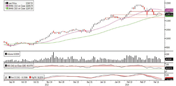
Technical analysis of the QE index
The QE Index ended the volatile week on a slightly positive note and snapped its three-week losing streak. The index attempted to halt its recent down move and closed last week on a predominantly flattish note. The index after Sunday’s decline witnessed a short-rally on Monday & Tuesday and managed to climb above the 11,400.0 psychological level. However, the rally was short-lived as the index reversed in the remaining two trading sessions. Meanwhile, the index has strong support near the 11,300.0 level, which is also in proximity to the 55-day moving average (currently at 11,307.30). We believe if the index can stay above 11,300.0 and attempt a rebound above the 11,400.0-11,480.0 levels, it may set the stage for a further higher move toward the 11,500.0-11,600.0 levels. However, if the index fails to cling onto to its support of the 55-day moving average and the 11,300.0 level it may result in bearish implications and may drift lower to test the next important support near the 11,170.0 level. Further, the RSI is stalling, while the MACD continues to grow more bearish. Thus, we expect the volatility to continue.
Definitions of key terms used in technical analysis
RSI (Relative Strength Index) indicator – RSI is a momentum oscillator that measures the speed and change of price movements. The RSI oscillates between 0 to 100. The index is deemed to be overbought once the RSI approaches the 70 level, indicating that a correction is likely. On the other hand, if the RSI approaches 30, it is an indication that the index may be getting oversold and therefore likely to bounce back.
MACD (Moving Average Convergence Divergence) indicator – The indicator consists of the MACD line and a signal line. The divergence or the convergence of the MACD line with the signal line indicates the strength in the momentum during the uptrend or downtrend, as the case may be. When the MACD crosses the signal line from below and trades above it, it gives a positive indication. The reverse is the situation for a bearish trend.
Candlestick chart – A candlestick chart is a price chart that displays the high, low, open, and close for a security. The ‘body’ of the chart is portion between the open and close price, while the high and low intraday movements form the ‘shadow’. The candlestick may represent any time frame. We use a one-day candlestick chart (every candlestick represents one trading day) in our analysis.
Doji candlestick pattern – A Doji candlestick is formed when a security’s open and close are practically equal. The pattern indicates indecisiveness, and based on preceding price actions and future confirmation, may indicate a bullish or bearish trend reversal.