


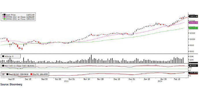
Technical analysis of the QE index
The QE index recorded gains for the second straight week, as it tagged a new five-year high. The index closed at 11,872.40, up about 3.1% for the week. The index moved higher in four of the five trading sessions, as it broke above its resistance level of 11,734 as well as the psychological resistance of 11,800. The upmove over the last couple of weeks was supported by high trading volumes, which is always a positive sign. The MACD is diverging away from the signal line on the positive side, while the RSI is trending higher in the overbought zone. Thus, with both the technical indicators providing a bullish signal, the uptrend is likely to continue. However, we cannot rule out short-term profit booking after the strong gains witnessed over the last couple of weeks. The next immediate resistance is seen near the 11,910 level followed by the 12,000 level, which could be a strong psychological resistance. On the flip side, support is seen at the 11,734 level, after which the next support is around the 11,680 level.
Definitions of key terms used in technical analysis
RSI (Relative Strength Index) indicator – RSI is a momentum oscillator that measures the speed and change of price movements. The RSI oscillates between 0 to 100. The index is deemed to be overbought once the RSI approaches the 70 level, indicating that a correction is likely. On the other hand, if the RSI approaches 30, it is an indication that the index may be getting oversold and therefore likely to bounce back.
MACD (Moving Average Convergence Divergence) indicator – The indicator consists of the MACD line and a signal line. The divergence or the convergence of the MACD line with the signal line indicates the strength in the momentum during the uptrend or downtrend, as the case may be. When the MACD crosses the signal line from below and trades above it, it gives a positive indication. The reverse is the situation for a bearish trend.
Candlestick chart – A candlestick chart is a price chart that displays the high, low, open, and close for a security. The ‘body’ of the chart is portion between the open and close price, while the high and low intraday movements form the ‘shadow’. The candlestick may represent any time frame. We use a one-day candlestick chart (every candlestick represents one trading day) in our analysis.
Doji candlestick pattern – A Doji candlestick is formed when a security’s open and close are practically equal. The pattern indicates indecisiveness, and based on preceding price actions and future confirmation, may indicate a bullish or bearish trend reversal.