Technical analysis of the QE index
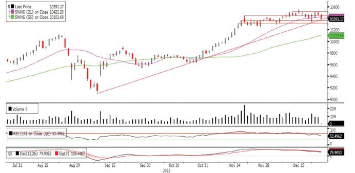
The QE Index ended last week’s volatile session on a negative note as bears proved to be more dominant than the bulls. The index started the week on a bearish note but recouped its losses on Monday and Tuesday as it witnessed a stunning recovery near the 10,320.0 level, pushing it to a higher level. However, the rally was short-lived as the index erased all its gains on Wednesday and Thursday as it failed to make any further headway above 10,520.0, and drifted lower penetrating below the important supports of 10,445.44 and the 21-day moving average (currently at 10,421.20). The index is currently trading close to the key support of the long-term ascending trendline. If the index dips below this trendline, it may result in a lower move and test the immediate support near the 10,360.0 level. Any sustained weakness below this level may have bearish implications, resulting in a pullback toward the 10,300.0 level. We believe the bears may continue to overpower the bulls as long as it trades below the 21-day moving average and the 10,445.44 level. Bulls may only come in action when the index surpasses these two levels. Meanwhile, both momentum indicators are moving down and are providing bearish signals, suggesting a likely down move.
Definitions of key terms used in technical analysis
RSI (Relative Strength Index) indicator – RSI is a momentum oscillator that measures the speed and change of price movements. The RSI oscillates between 0 to 100. The index is deemed to be overbought once the RSI approaches the 70 level, indicating that a correction is likely. On the other hand, if the RSI approaches 30, it is an indication that the index may be getting oversold and therefore likely to bounce back.
MACD (Moving Average Convergence Divergence) indicator – The indicator consists of the MACD line and a signal line. The divergence or the convergence of the MACD line with the signal line indicates the strength in the momentum during the uptrend or downtrend, as the case may be. When the MACD crosses the signal line from below and trades above it, it gives a positive indication. The reverse is the situation for a bearish trend.
Candlestick chart – A candlestick chart is a price chart that displays the high, low, open, and close for a security. The ‘body’ of the chart is portion between the open and close price, while the high and low intraday movements form the ‘shadow’. The candlestick may represent any time frame. We use a one-day candlestick chart (every candlestick represents one trading day) in our analysis.
Doji candlestick pattern – A Doji candlestick is formed when a security’s open and close are practically equal. The pattern indicates indecisiveness, and based on preceding price actions and future confirmation, may indicate a bullish or bearish trend reversal.