Technical analysis of the QE index
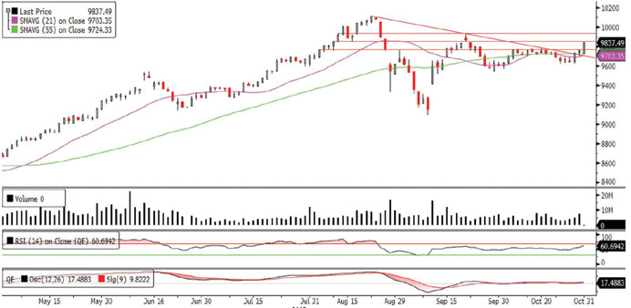
The QE Index ended last week on a positive note closing at its weekly high. After witnessing a bullish start on Sunday, the index continued its uptrend during the week, revealing little weakness on Tuesday. The index rebounded near the support of the 9,600.0 psychological level as buyers stepped in and quickly offset the weakness, surpassing the stiff resistance of the descending trendline at 9,700.0, which had restricted its bullish move in the past. This was a nice display of strength, signifying a shift in the underlying sentiment. The breach of the resistances of 9,766.28 and 9,800.0 levels in a single swoop on Thursday were positive developments, indicating rising buying interest. Technically speaking, we believe if the index can stay above the descending trendline, it may set the stage for a higher move and test the 9,900.0-10,000.0 levels since it has strong momentum going in. Moreover, the RSI and the MACD lines are providing bullish signals indicating that the index has enough steam to accelerate further. However, on the flip side traders may keep a close watch on the descending trendline, which is also in proximity to the 55-day moving average (currently at 9,724.33) for any reversal signs as a dip below it may result in a bearish implication.
Definitions of key terms used in technical analysis
RSI (Relative Strength Index) indicator – RSI is a momentum oscillator that measures the speed and change of price movements. The RSI oscillates between 0 to 100. The index is deemed to be overbought once the RSI approaches the 70 level, indicating that a correction is likely. On the other hand, if the RSI approaches 30, it is an indication that the index may be getting oversold and therefore likely to bounce back.
MACD (Moving Average Convergence Divergence) indicator – The indicator consists of the MACD line and a signal line. The divergence or the convergence of the MACD line with the signal line indicates the strength in the momentum during the uptrend or downtrend, as the case may be. When the MACD crosses the signal line from below and trades above it, it gives a positive indication. The reverse is the situation for a bearish trend.
Candlestick chart – A candlestick chart is a price chart that displays the high, low, open, and close for a security. The ‘body’ of the chart is portion between the open and close price, while the high and low intraday movements form the ‘shadow’. The candlestick may represent any time frame. We use a one-day candlestick chart (every candlestick represents one trading day) in our analysis.
Doji candlestick pattern – A Doji candlestick is formed when a security’s open and close are practically equal. The pattern indicates indecisiveness, and based on preceding price actions and future confirmation, may indicate a bullish or bearish trend reversal.