Technical analysis of the QE index
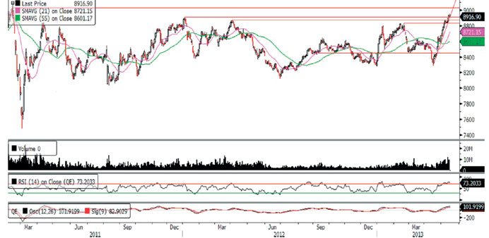
The QE Index breached its resistance level of 8,875.0 during the week to continue its uptrend. The index not only tagged a new 52-week high of 8,938.84 last week, but also surpassed its previous high of 8,910.21 (January 2012). However, the index did not make further headway and witnessed some profit booking over the last couple of days to close the week at 8,916.9, registering a gain of 0.78%. The RSI is in the overbought zone, indicating that we may see some profit booking this week. Further, the MACD is also converging with the signal line, suggesting that the index may consolidate around the current levels. Thus, traders may watch out for a retracement toward the 8,900.0 levels before a higher move, with the two key levels to watch out for being the 8,875.0 and 8,835.0 levels on the downside. If the index breaks this level, the next support will be provided by the moving averages (currently at 8,721.15 and 8,601.17). On the upside, the 9,000.0 level will be an important psychological mark, after which the next strong resistance is at the February 2011 high of around 9,035.0.
Definitions of key terms used in technical analysis
|
|
RSI (Relative Strength Index) indicator – RSI is a momentum oscillator that measures the speed and change of price movements. The RSI oscillates between 0 to 100. The index is deemed to be overbought once the RSI approaches the 70 level, indicating that a correction is likely. On the other hand, if the RSI approaches 30, it is an indication that the index may be getting oversold and therefore likely to bounce back.
MACD (Moving Average Convergence Divergence) indicator – The indicator consists of the MACD line and a signal line. The divergence or the convergence of the MACD line with the signal line indicates the strength in the momentum during the uptrend or downtrend, as the case may be. When the MACD crosses the signal line from below and trades above it, it gives a positive indication. The reverse is the situation for a bearish trend.
Candlestick chart – A candlestick chart is a price chart that displays the high, low, open, and close for a security. The ‘body’ of the chart is portion between the open and close price, while the high and low intraday movements form the ‘shadow’. The candlestick may represent any time frame. We use a one-day candlestick chart (every candlestick represents one trading day) in our analysis.
Doji candlestick pattern – A Doji candlestick is formed when a security’s open and close are practically equal. The pattern indicates indecisiveness, and based on preceding price actions and future confirmation, may indicate a bullish or bearish trend reversal.