AFP/Paris
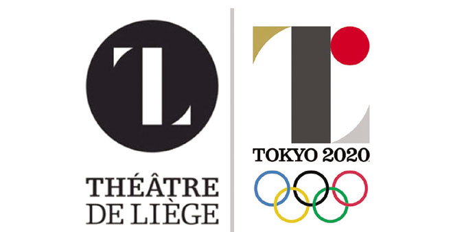
Tokyo’s 2020 Olympic emblem has triggered controversy and threats of possible legal action in Europe due to its resemblance to the logo of a Belgian theatre and a separate Spanish design.
In the latest public relations blow to Tokyo after plans for its $2 billion Olympic stadium were ditched, a Belgium-based designer took to social media to register surprise over the similarities between the logos.
“Striking when you know the Liege Theatre logo has been regularly shared on Pinterest,” Studio Debie wrote on its Facebook page.
“Even the typography is the same.” The designer himself, Olivier Debie, told AFP when contacted later yesterday that he was “a bit puzzled” by events and was considering legal action.
“When I put one design over the other, it seems difficult to think it is just a coincidence,” he said from the eastern Belgium city of Liege.
“For such a visible logo (as that of the Olympics), it should not look like anything else,” he added. Tokyo Olympic organisers on Thursday defended the design.
“The official emblem of the Tokyo 2020 Olympic Games captures the essence of our vision for the 2020 Games,” they said in a statement. “It will represent the Games on the world stage.
“Prior to the selection of this design, the Tokyo 2020 Organising Committee conducted long, extensive and international verifications through a transparent process.”
Earlier, Japanese government spokesman Yoshihide Suga declined to make a formal comment, insisting officials had exercised due diligence prior to unveiling the logo last week.
“We are aware of the reports that the 2020 Olympic Games logo is similar to one for a Belgian theatre,” he told reporters.
“Before unveiling it, we received a report that there was no problem over trademarks following investigations in Japan and abroad.”
The Tokyo 2020 logo, which was unveiled last week, is based around the letter “T”—for Tokyo, tomorrow and team with a red circle representing a beating heart. It was designed by Japanese artist Kenjiro Sano.
Asked if he thought the logos were similar, Suga said with a sheepish grin: “Well I guess it varies from person to person. In any case, the government will refrain from official comment.”
Embarrassingly, claims emerged that it also bore remarkable similarities to a design by Barcelona-based firm Hey Studio created in support of Japan, following the deadly quake-tsunami disaster in 2011.