Technical analysis of the QE index
|
|
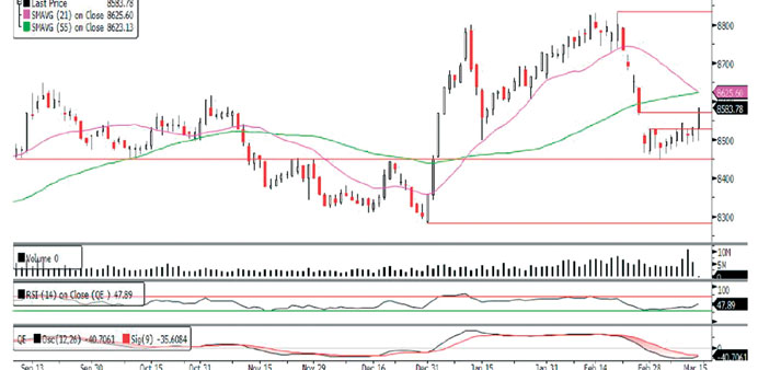
The QE Index ended last week with a bullish resolution, as it closed at its weekly high. After witnessing a bullish start on Sunday, the index continued to press on with the action during the week, revealing little weakness on Tuesday. By Thursday, the index successfully filled up the open gap left near the 8,570.0 levels, which was a nice display of strength, signifying a shift in the underlying sentiment. In our previous commentary, we had mentioned that there may be some improvement in the market’s underlying sentiment and last week witnessed continued buying on weakness. Both Monday and Thursday saw lower prices earlier during the day, only to see buyers stepping in and closing the index at its highest points. A further higher high would suggest that the correction is over. However, the index has immediate resistance at its moving averages (currently around the 8,625.0 level). If the index can reclaim these moving averages and fill up the gaps left near the 8,690.0 and 8,730.0 levels, it could set the stage for an eventual test of this year’s high of 8,835.86. Meanwhile, the index has support for further higher move from the RSI, which is moving stronger and is likely to cross the midline toward the bullish territory. Moreover, the MACD also appears to be heading for a bullish crossover.
Definitions of key terms used in technical analysis
|
|
RSI (Relative Strength Index) indicator – RSI is a momentum oscillator that measures the speed and change of price movements. The RSI oscillates between 0 to 100. The index is deemed to be overbought once the RSI approaches the 70 level, indicating that a correction is likely. On the other hand, if the RSI approaches 30, it is an indication that the index may be getting oversold and therefore likely to bounce back.
MACD (Moving Average Convergence Divergence) indicator – The indicator consists of the MACD line and a signal line. The divergence or the convergence of the MACD line with the signal line indicates the strength in the momentum during the uptrend or downtrend, as the case may be. When the MACD crosses the signal line from below and trades above it, it gives a positive indication. The reverse is the situation for a bearish trend.
Candlestick chart – A candlestick chart is a price chart that displays the high, low, open, and close for a security. The ‘body’ of the chart is portion between the open and close price, while the high and low intraday movements form the ‘shadow’. The candlestick may represent any time frame. We use a one-day candlestick chart (every candlestick represents one trading day) in our analysis.
Doji candlestick pattern – A Doji candlestick is formed when a security’s open and close are practically equal. The pattern indicates indecisiveness, and based on preceding price actions and future confirmation, may indicate a bullish or bearish trend reversal.